McChrystal Group Website Redesign
A global advisory services and leadership development firm that specializes in shaping organizational functionality and culture
-
I was contracted to redesign the look and feel of McChrystal Group’s website. The old static website was improved to enhance user experience and provide a clearer understanding of the services offered. For this project, I collaborated with the chief marketing officer and brand designer.
-
Solo UX/UI Designer
Team: brand designer, chief marketing officer
Timeline: November 2021 - July 2022
Tools: Figma
Disclaimer: The imagery reflected in the final redesigns are placeholder images for purposes of mockup and not related to the McChrystal Group brand.
UNDERSTANDING THE GOALS
McChrystal Group’s website needed a refresh on the look and feel in addition to new functionality.
The website was missing key modules to show important content i.e. featured case studies, insights, statistics. I discussed with the team (chief marketing officer + brand designer) on how to improve the website and create a great experience for users.
REDESIGNED PAGES
Here are the pages that I redesigned with a comparison of the before and after. I presented these final designs to the team. I took into account the needs and goals of the team and redesigned it for a better user experience.
Home Page
The home page revamp was a big focus of the project since it’s the main page where visitors will get a first impression of the company. It was a priority to improve it so that the services offered were understood clearly.
When users visit the site for the first time, we want them to know what the company does at a glance and see the impact of our services.
Before
Existing Design (Before)
After
Redesigned (After)
Insights Page
The previous insights page was hard to organize and difficult to navigate. The goal of the redesign was for it to be more accessible and easier to understand.
I improved the insights page to be more impactful and to have a more organized layout. A social media section was also added to bring more visibility to the social feeds.
Before
Existing Design (Before)
After
Redesigned (After)
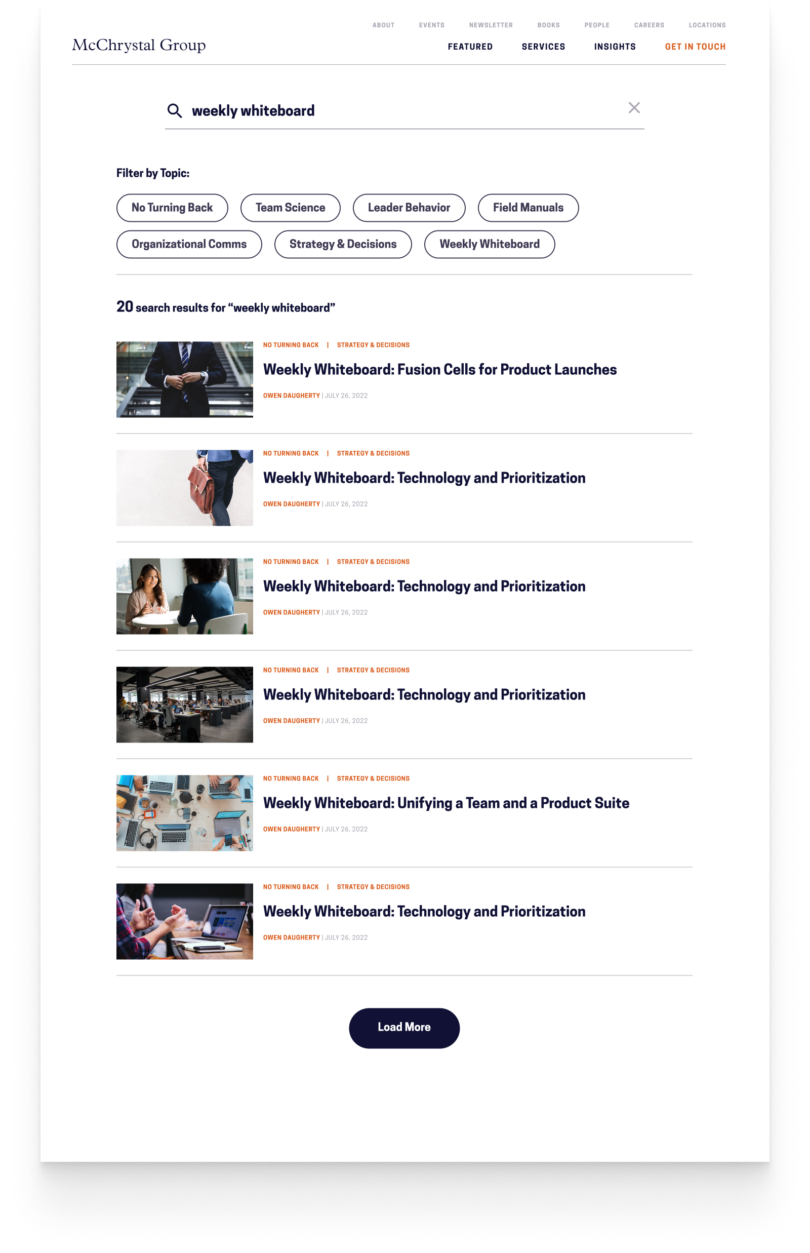
Insights Search Function
I implemented a new search function on the insights page so that it would be easier to search for articles and explore unfamiliar topics.
Search Bar
Search Bar ( keyword enter)
Search results
Case Study Page
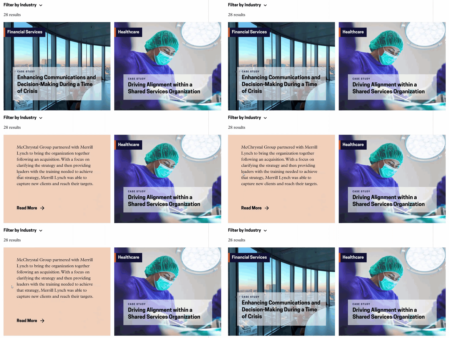
The case study page needed to be improved visually and have a filter in place to easily find case studies.
The redesigned page includes a featured case studies section and a filter by industry. The two column layout also shows more content and reduces the need to constantly scroll.
Before
Existing Design (Before)
After
Redesigned (After)
Design Process
How do I design something new that would fit in well with McChrystal Group’s existing elements?
RESEARCH AND INSPIRATION
I wanted to be exposed to a variety of different designs to gain a better idea of how to approach the redesign. I looked at competitor websites to see what they were doing well. I also looked at other websites that had good design for inspiration.
WIREFRAMING, PROTOTYPING AND ITERATING!
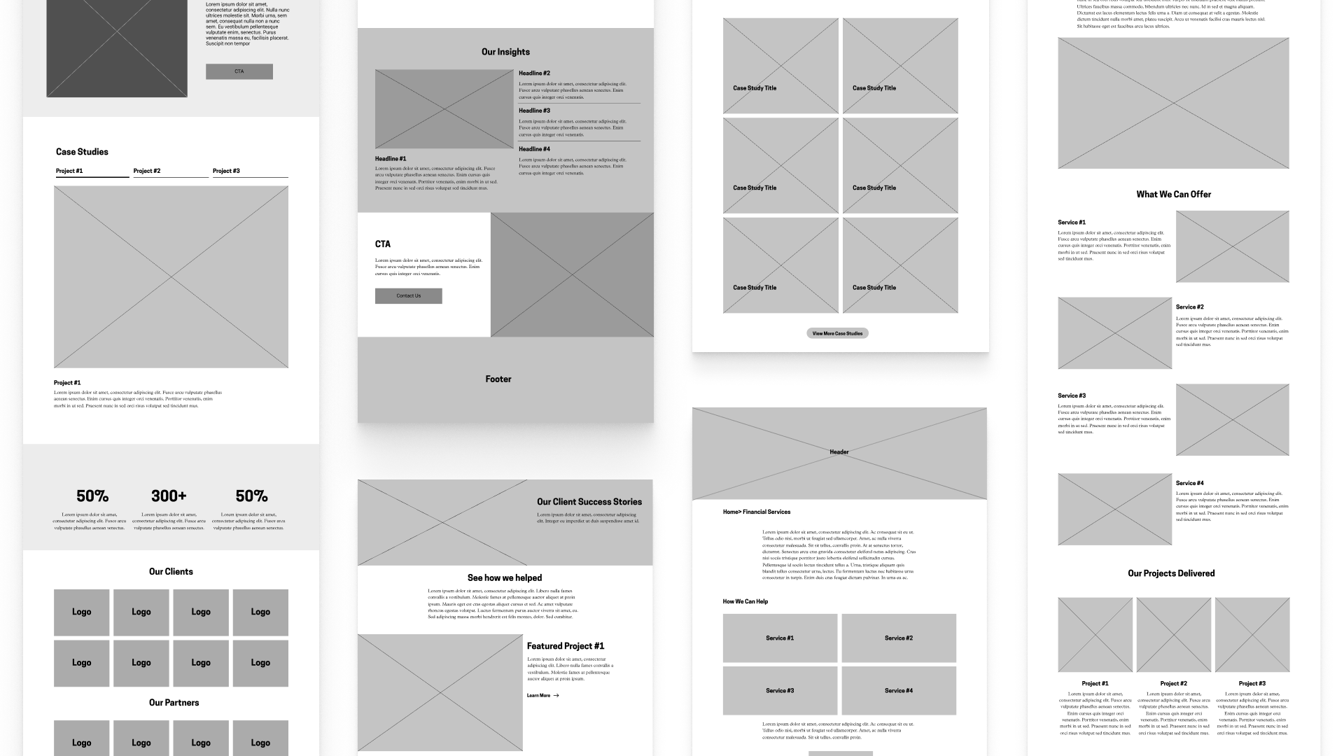
For pages that needed more thinking, I started with sketches and low fidelity wireframes. For other pages, I jumped straight into high fidelity wireframes. I kept in mind that the final product was going to be built in separate modules so I wanted the designs to be flexible.
laying out pages with lofi wireframes
some iterations on hifi wireframes
From the wireframes, I created prototypes to show the team how the designs would look and feel. It was especially important to show the micro animations and how it would elevate the overall experience.
Throughout the design process, I followed the existing brand guidelines provided by the company. For the purposes of this portfolio, I replaced all images with stock photos.
MOBILE OPTIMIZATION
Optimizing the mobile site was a priority since a sizable portion of users browsed the site on their mobile devices.
In addition to utilizing responsive design, there were certain content that we wanted to spotlight more than others. I designed the pages to reflect that idea while keeping in mind mobile best practices. Since there was limited space on mobile, I kept the pages short and simple to reduce load times.
Reflection
Next Steps
Continue improving the rest of the site - Since there are still pages on the site that haven’t been improved yet, the next steps would be to work on those pages so that the site as a whole feels unified.
Launch the new website and receive user feedback - The designs have been handed off to development and will be launched soon. Ideally, I would like to gather feedback on how the designs are received by the users and incorporate those changes into the next version.
What I Learned
Looking at designs from another perspective - When I had meetings with the team, I often found myself learning about how others think.
What if we did “x” like this? How would “y” be if we changed that?
Working with people from other backgrounds gave me the opportunity to think about things in another perspective- something that wouldn’t be possible on solo projects.
How a CMS works - I learned how to edit and manage a website with a content management system. With that knowledge, it allowed me to better design new modules for the CMS. Since I understood what goes behind the scenes a bit more, I was able to envision how my designed modules were going to be used.
Thanks for reading!
Take a look at my other projects:
Next Dessert
A dessert cafe looking to establish their online presence and expand their business with a modern responsive website
MOOVIE
A movie ticketing app that provides a seamless experience for buying tickets and ordering food


