Next Dessert Responsive Website
A dessert cafe looking to establish their online presence and expand their business with a modern responsive website
-
This was a conceptual project that I created for the Google UX Design Certificate courses. I wanted to build a fluid online experience by understanding more about responsive design.
-
UX Researcher, UX/UI Designer
Timeline: November 2021 - February 2022
Tools: Figma
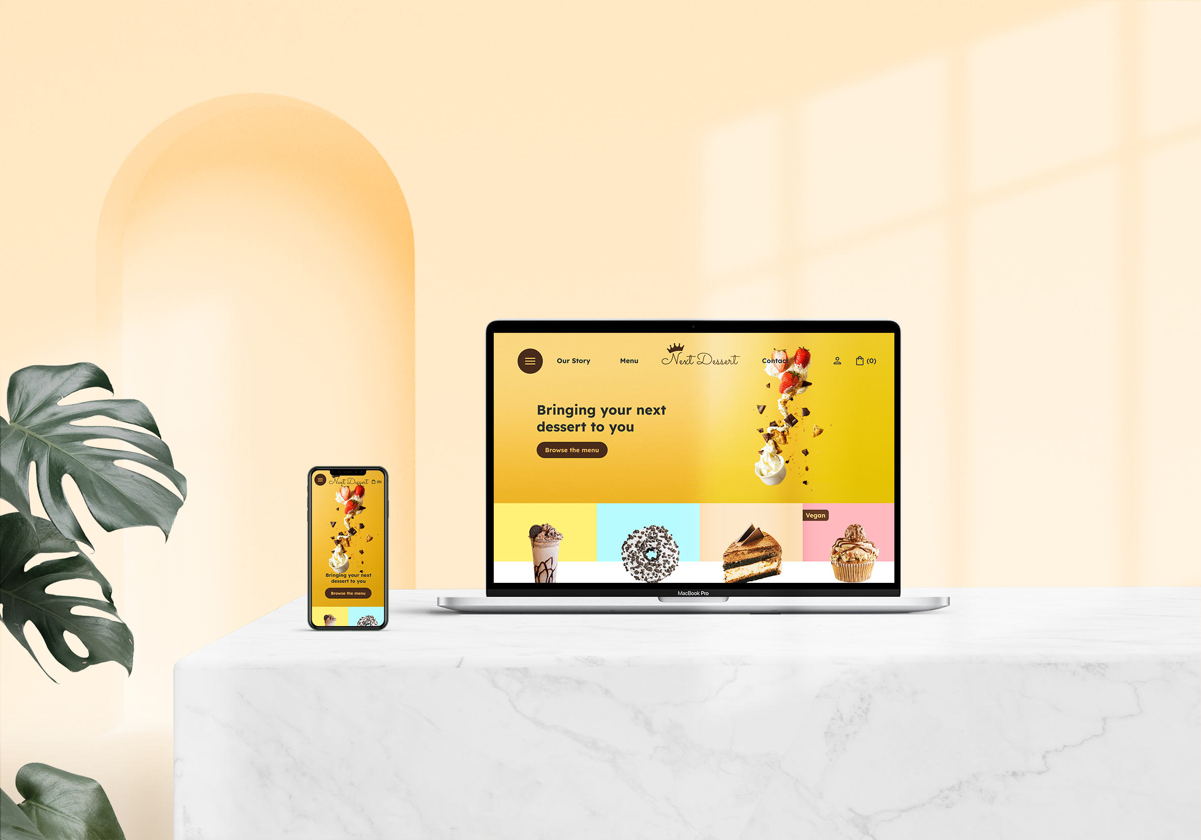


Easily navigate the menu
View product information and customize with ease

Know where your order is with confidence

UNDERSTANDING THE PROBLEM
Next Dessert is a local dessert cafe that has been around for many years and is looking to expand their products to an online audience.
Because of a slow economy and social distancing, they want to look for ways to sustain their income and keep their doors open.
Business goals:
create a user friendly and inviting website to attract new and repeat customers
increase their sales by having pickup and delivery orders
User goals:
find the products they want quickly and have a smooth checkout process
browse on mobile and have the same fluid experience as on the desktop
Learning More About The Users
USER INTERVIEWS
I conducted user interviews with people that were familiar with online food ordering and liked to visit cafes.
To gain a deeper understanding of the potential users of the dessert cafe, I wanted to learn more about their habits, experiences of visiting, and what they like/dislike. By having their input, I can find ways to improve upon existing systems and implement the changes to the new website.
Questions such as:
Do you have any concerns when ordering food/drinks from a website?
What kind of features would encourage you to order food/drinks?
Think about your experiences with visiting a restaurant/cafe/bakery website. What is the purpose of your visit to the website? What kind of information are you looking for?
To analyze the gathered information, I created empathy maps.

Empathy Map for Peter (persona #1)

Empathy Map for Hailey (persona #2)
From the interviews, I identified a few common pain points among the participants:
Not listing allergens - Many websites do not list food allergens that are in their products, which can turn away some users.
Mobile site optimization - On mobile devices, some sites are not user friendly, which leads to a frustrating experience.
Bad photos - Low quality, bad photos make users lose trust in the products and therefore reduce sales.
Confusing navigation - It is annoying to dig through other content to find what the user wants.
Through the gathered data, I created two different personas that reflected potential users of the cafe.

Age: 33
Education: Bachelor’s Degree
Occupation: Video Editor
Peter - Persona #1
“I’m vegan & gluten-intolerant, & a lot of places aren’t accommodating for that.”
Peter works as a video editor full time and likes to enjoy sweets after a long day of work. He is frustrated when websites don’t include potential food allergens in their description because he has diet restrictions. He wants to be able to quickly browse the menu and check out seamlessly while at the office on his mobile so he can go pick up his order after work.
Frustrations:
-Many websites don’t list food allergens
-Websites look weird on mobile devices
-Lack of selection/ customization
Goals:
-Easy navigation of menu
-Fast ordering using saved info.
-Food allergens/ restrictions are clearly labeled

Age: 21
Education: In College
Occupation: Student
Hailey - Persona #2
“Expensive or bad previous cake photos would prevent me from ordering”
Hailey is a full time college student. She is on a budget but enjoys eating cake. If there were discounts/coupons available, she would visit cafes more often. When choosing a cafe, she does research online and looks at the photos/prices before deciding. High quality photos and a sleek modern website are more likely to attract her.
Frustrations:
-Websites may show fake reviews or misleading photos
-Websites look weird on mobile devices
-Not knowing where her order is
Goals:
-Discounts/ coupons to encourage ordering
-Having high quality photos and sleek modern website
-Being able to track order with progress bar
Learning More About The Competition
To learn best practices and get inspiration, I did research on direct competitors as well as indirect competitors. I looked up dessert cafes, cake shops, restaurants, and food delivery services. I wanted to see how others have set up their websites, what could be improved on, and how I can take what works and make it better. Some things I looked at were the navigation, mobile responsiveness, how products were displayed, the checkout flow, and overall visual design.

visually appealing imagery

item selection

product display
online ordering

cart checkout
Starting the Design Process
With a deeper understanding of the users and the competitors, I set out to create the frameworks of the website. To start off, I made a list of the possible content pages and reorganized that into a sitemap. I focused on easy navigation, with all pages being reached in a maximum of 3 clicks.

Sitemap of the website
LOFI WIREFRAMES
Next, I went ahead and sketched out possible layouts of the site. These sketches were loose and were meant for me to quickly iterate. From there, I created low fidelity wireframes of basic pages and the user checkout flow. I made two versions from the get go- desktop and mobile, so that it would be easier to implement later on in the process. Since this was an iterative process, I didn’t want to commit to using any particular fonts, styles or colors at this stage.

Low fidelity wireframes - desktop

Low fidelity wireframes - mobile
Iterating on the Initial Designs
USABILITY STUDY
After creating some low fidelity wireframes, I wanted to test out the designs with users. I conducted an unmoderated usability study remotely to see how effective my designs were.
The main goals of the study were to see if users had any difficulties in using the website, especially the ordering process and navigation.
I also wanted feedback on features that users would like to see implemented or changed.
Questions such as:
-When ordering food online, what device are you likely to browse with?
-Are there any features that you think will help the checkout process become faster and more efficient?
In addition to asking questions, I also asked the participants in the study to go through an early prototype of the website with prompts:
-Say you want to learn more about an iced vanilla latte and see if there are any allergens. How would you navigate the website?
-Say you want to buy a slice of strawberry cake online and go pick it up in the store. How would you go about doing that from the homepage?
AFFINITY MAPPING
I organized the feedback into separate categories and looked for insights by using an affinity map. The insights that I identified were:
Theme: Some users found the order checkout process confusing
Insight: Change the order process to adding items to cart first and then selecting pickup/deliveryTheme: Most users browse and order from their phones
Insight: Focus the website on being mobile friendly for usability and ease of checkoutTheme: Some users prefer checking out as a guest
Insight: Have 3rd party account integration so that their info is saved for easy access without creating an accountTheme: Some users had trouble with finding allergy info
Insight: Make the allergy info more visible on the product pageTheme: Some users found the website layout to be typical
Insight: Change the layout to be more exciting but still maintain ease of use and navigation.

Affinity map of usability study feedback
ITERATIONS
After receiving the feedback from the participants, I worked on improving the checkout flow and updating the designs.
Someone had pointed out that the current layout was boring, which I agreed with. I did some additional research to get inspired by unique layouts and see what I could do to create a more exciting layout but maintain ease of use.

featured items list

menu

homepage navigation

bold colors and imagery

cart checkout

Updated sitemap

Iterations on initial designs
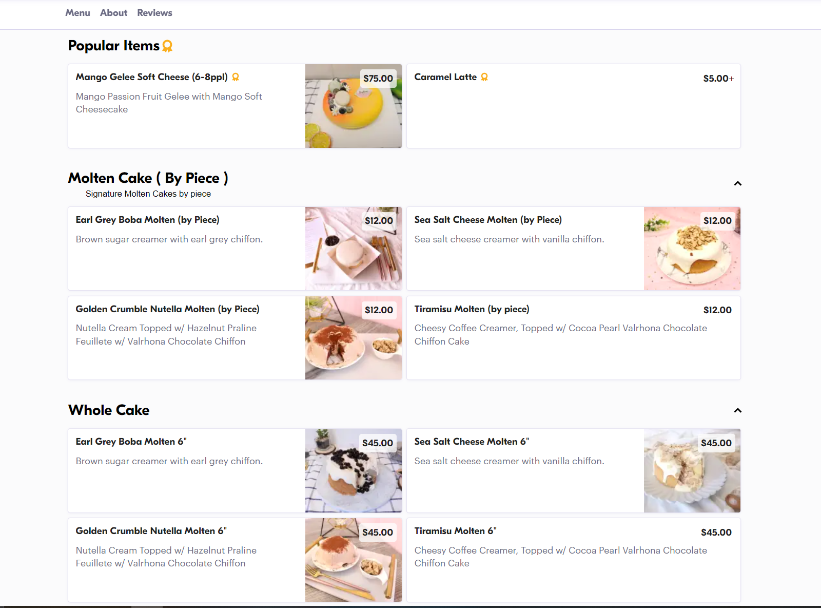
Final Designs!
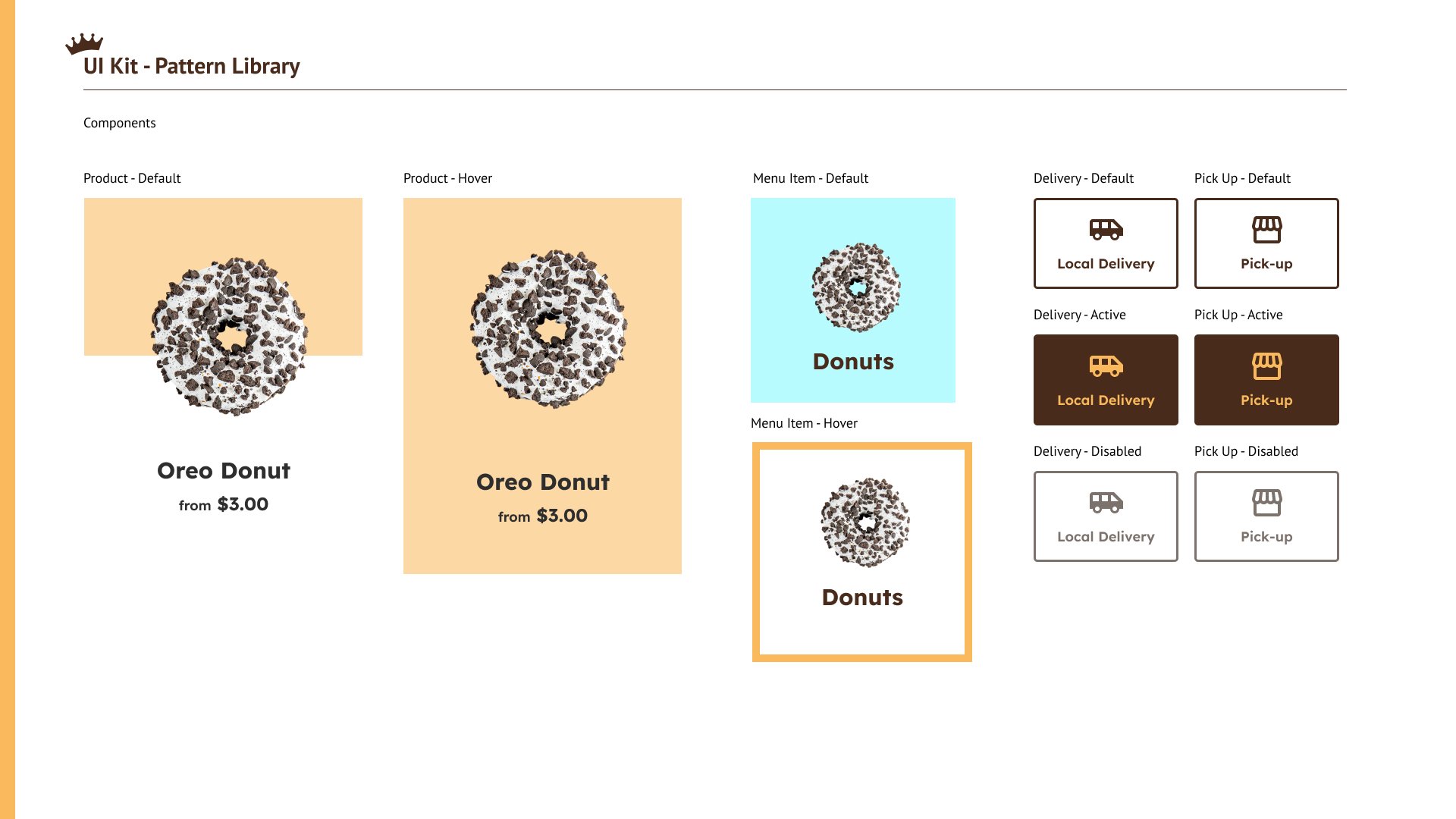
UI KIT
The brand tone that I was envisioning - modern, appetizing, and playful. Products are handcrafted with love and real ingredients.
Lexend was chosen as the main typography because it fit the brand tone.
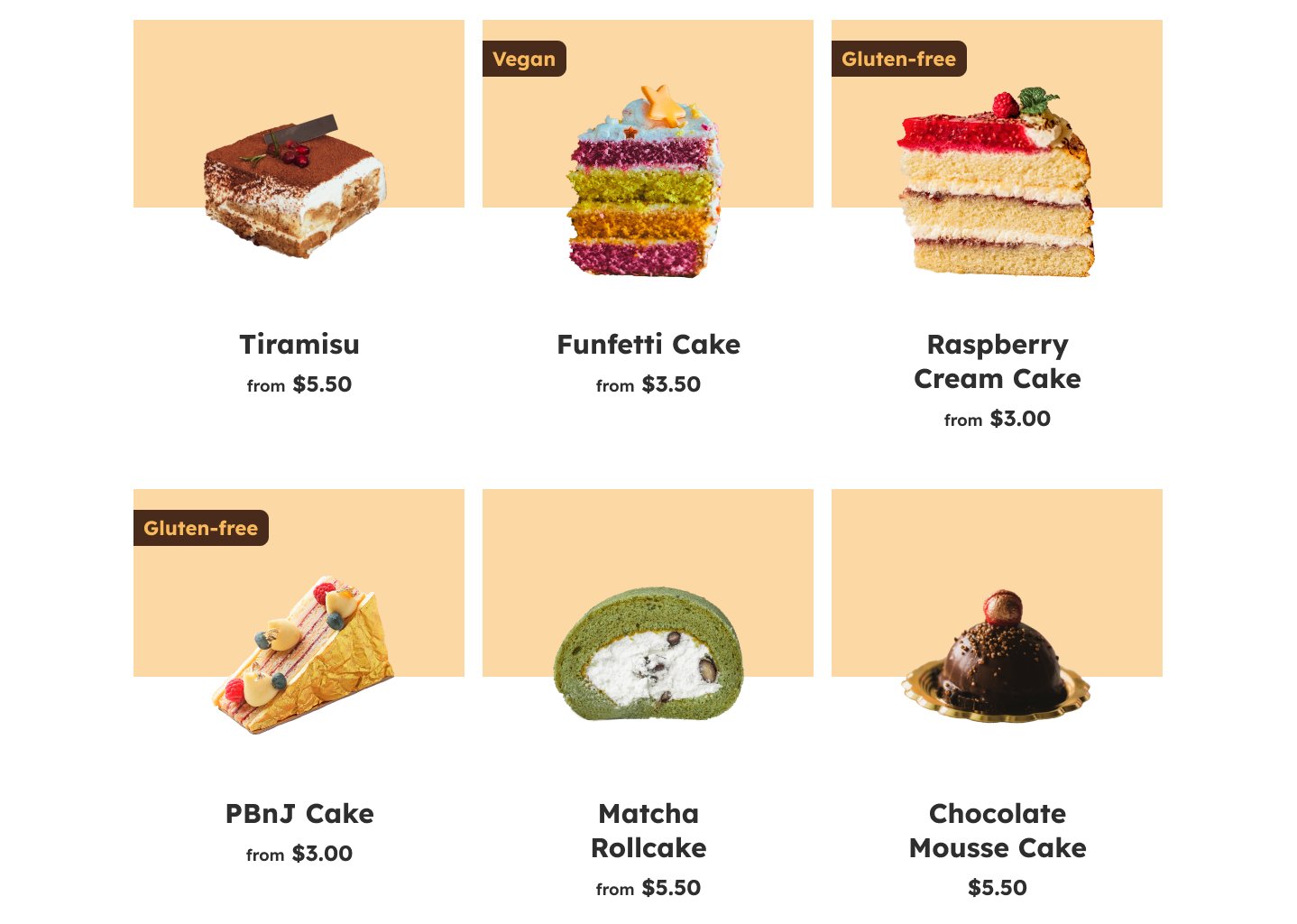
The main colors, wafer and chocolate, were inspired by baked goods (specifically tiramisu). The colors were tested to meet the WCAG standards for accessibility. The secondary set of colors includes a wide range of pastels to brighten up the whole site. Combined with high quality images, it creates an attractive display of products.


Results and Takeaways
For the final designs of the website, I worked to address the pain points of the initial research and the findings of the usability study. I also made sure to include the user goals and business goals in mind during this process.

Pain point: Not listing allergens
Solution: I made sure the allergy section of the product page was visible by including a colored icon and having it above the fold.

Pain point: Mobile site optimization
Solution: For the mobile version of the site, I intended it to be easy to browse and navigate. The content was resized and put in a slightly different layout from the desktop version, but the experience remains the same.
Pain point: Bad photos
Solution: A big focus throughout the site was to have high quality, appealing imagery to attract users.

Pain point: Confusing navigation
Solution: To avoid any confusion with navigating the site, I differentiated the sections with pictures and color. A click on the menu icon would reveal the simple layout.
Takeaways
By doing this project, I learned how to better design a responsive website. This was an exciting project for me because it exposed me to dynamic website experiences through my research. I wanted to apply those aspects to my own project so I learned how to create micro interactions on Figma. Although they are called micro interactions, I think it elevated my designs a lot! The difference between having a flat page and a page with animations is huge. I have only scratched the surface with that so I am looking forward to learning more.
My previous experiences with UI/UX have been mostly apps in the past, but now I am definitely interested in working on websites for the future!
Next Steps
I am satisfied with the results that I have achieved thus far, but if I were to continue working on this project, I would do another round of usability studies to see how users would react to the high fidelity prototypes. I am sure that I can find things to improve from there.
As for features to add, I would add a rewards program to the site. I think it would benefit users to have discounts and incentives to look forward to. I had considered it initially, but ultimately I had taken it out because of prioritizing other features and time constraints.
Thanks for reading!
Take a look at my other projects:

MOOVIE
A movie ticketing app that provides a seamless experience for buying tickets and ordering food

McChrystal Group Website Redesign
A global advisory services and leadership development firm looking to redesign their website