MOOVIE
A movie ticketing app that provides a seamless experience for buying tickets and ordering food
-
This was a conceptual project that I created for the Google UX Design Certificate courses. I learned how to take an app concept from the beginning to creating a high fidelity prototype.
-
UX Researcher, UX/UI Designer
Timeline: August 2021 - November 2021
Tools: Figma


What’s the problem?
For those who want a quick and contactless checkout experience at the movies, how might we help them?
Movie theaters have always been a popular place to hang out and have fun. Enjoying a great movie on the big screen is a magical experience that will be remembered for a long time. Although the movie industry has slowed because of the pandemic, it is starting to pick up again. For popular movies, there is still a big turnout, which results in long lines at both the ticketing area and the concession stand.
How can I help them?
By creating a movie ticketing app, users can book tickets and order food in advance which helps them save time.
They can skip long wait lines and choose seats based on their own preference. It also provides a contactless and quick way to show tickets.
What are users having trouble with?
USER INTERVIEWS
To understand user needs/frustrations and to identify common behavior/experiences, I interviewed several people who liked going to the movie theaters.
I avoided yes/no questions and opted for elaboration on their experiences. Some questions I asked were:
“What’s your process of finding a movie to watch?”
“Can you describe your experiences with getting tickets for a movie.”
“Are there any challenges or frustrations you’ve had with getting tickets or movie theaters in general?”
“What kind of features would you like to see in a movie theater app?”
From the interviews, I identified a few common pain points among the participants:
Navigation - Websites are hard to navigate, especially on mobile. Need a clear layout.
Seat/showtime selection - Seat and showtimes are not clear. Better charts are needed to reflect how busy it is.
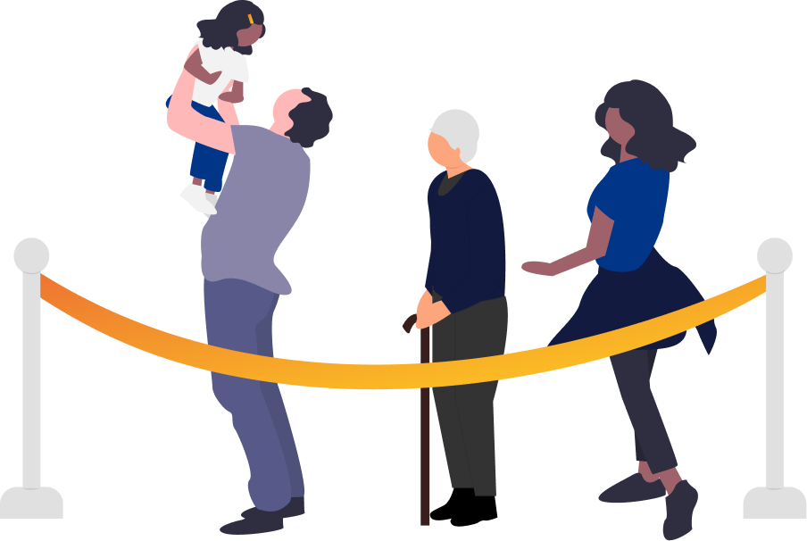
Long Lines - Waiting in long lines are frustrating. Need a quick and easy way to get tickets and food.
Price - Tickets are expensive. Would go more often if there were discounts/deals.
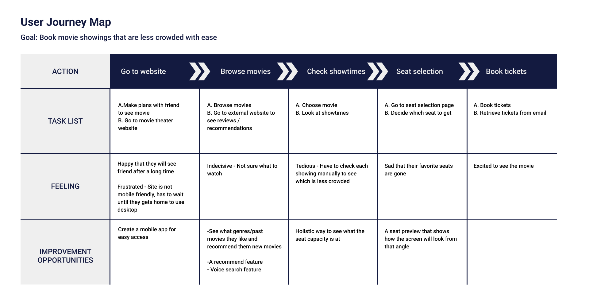
USER JOURNEY MAPPING
I wanted to take a deeper dive into the user journeys. That way, I can understand the current journey and find improvement opportunities.

User journey map 1
User journey map 2
To summarize, the main improvement opportunities I found were:
Create a dedicated app for easy and quick navigation
Allow food ordering in advance with tracking to save time
Add recommendation feature to discover new movies
Enhance seat preview experience
How are my competitors doing?
I compared the ticket booking experience and features that competitors offered. This is an important step in the UX design process because I can learn where current competitors are doing well and falling short.

By conducting the competitive audit, I was able to identify some gaps in the current competitors:
Seat preview for seat selection can be better
Movies are a social event for many, but the apps lack a share button
Being able to see your rewards easily
A simple way to order food
Because of these gaps, I thought about how I can improve the experience with these opportunities:
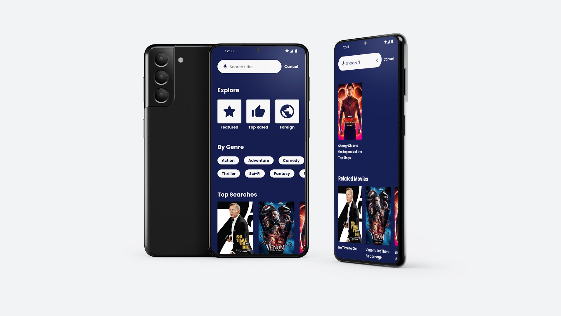
Adding visuals to the seat preview (i.e. pictures, 3D view)
Voice search for better accessibility
Easily share movie pages with friends
Optimized food ordering system
What does the user experience look like?
USER FLOW
Before creating wireframes for the app, I wanted to understand how users will move through the app and where they will potentially face troubles. Having a flowchart in mind helps me to anticipate the screens that are needed in the design process.

STORYBOARDING
I created two different storyboards to visualize the user journey. The big picture storyboard focuses on showing why the product is useful. The close-up storyboard focuses on the app functions more closely. At this stage, rather than design of the product, I concentrated on the most important parts of the user experience.
Big Picture - Use the app to book tickets and food easily

1) There is a long line at the theater. The user is frustrated.
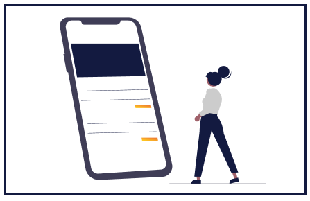
2) They use the app to book tickets.

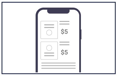
3) They also order food in the same checkout process.

4) They skip the line at the concession stand and pick up their order.

5) They show their ticket on their phone and go in the showing.

6) They happily enjoy the movie and the food!
Close-up - Use the app to book tickets and food easily

1) The user is welcomed!

2) They browse the movie selection.

3) After selecting a movie, they choose the showtime and seat.

4) They also order food and drinks.
5) They get to the checkout page.
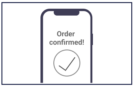
6) They get a confirmation for their order!
Time to start designing!
LOW FIDELITY WIREFRAMES
With all that in mind, I was ready to start designing the screens. I started with sketching my ideas on paper and then moved onto digital low fidelity wireframes. I initially used blocks to not focus on details and then eventually added text when I got further in the process.
USABILITY TESTING
I linked the screens to create a low fidelity prototype. With that in hand, I conducted a usability study to test out the features of the app. The goals of my research were to:
See if users find the checkout process and navigation easy to use.
See if there are any difficulties in using the app.
See if there are any features that users would like to see implemented.
The participants ordered tickets and food through the prototype and then completed a survey on their experience. I asked for feedback on how easy/difficult it was to complete the task and a questionnaire on the system usability scale.
I created an affinity map to organize the feedback. From there, I identified a few insights from this study:
Theme: Putting orders in the profile tab is difficult to find for most users
Insight: Users need a more intuitive way to access the orders page.
Theme: A majority of the users had difficulty with the ordering system
Insight: We need to simplify the food ordering process and add more navigational cues to help users.
Theme: For some users, seeing the number of seats available is more helpful than a percentage
Insight: We need to make the wording more clear to avoid confusion in the seat capacity.


Results
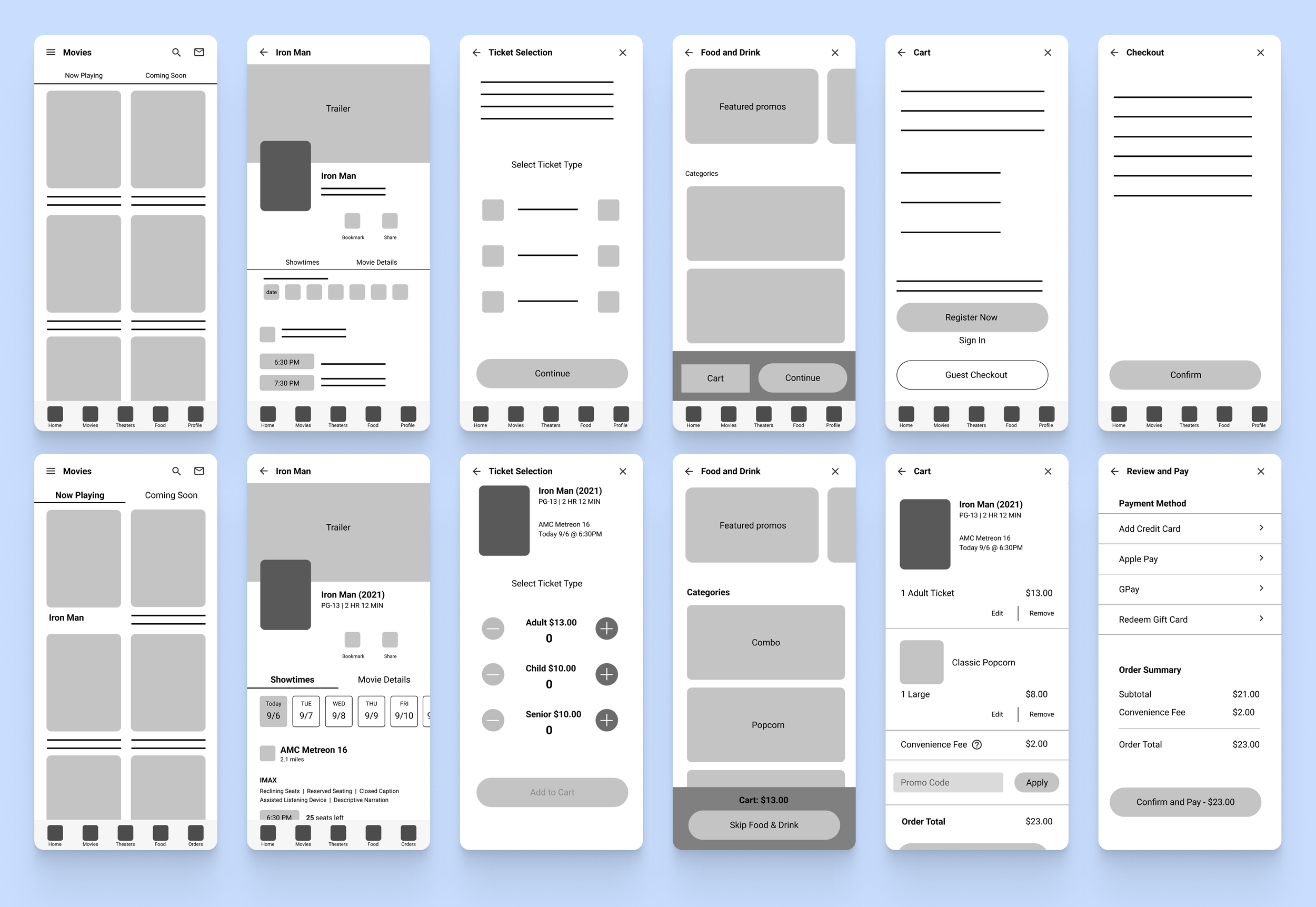
I kept the user pain points and improvement opportunities in mind and designed the app to reflect a better user experience.

Pain point: Clearer Navigation
Solution: The navigation bar is split into 5 different sections that users visit the most often - movies, theaters (locations), food& drink ordering, rewards, and my tickets. The hamburger menu houses less popular pages i.e. settings, my account.

Pain point: Seat/showtime selection
Solution: Having a preview of the seat/screen angle helps the users choose seats with confidence. Being able to see the available seats in each showing indicates which ones are more popular.
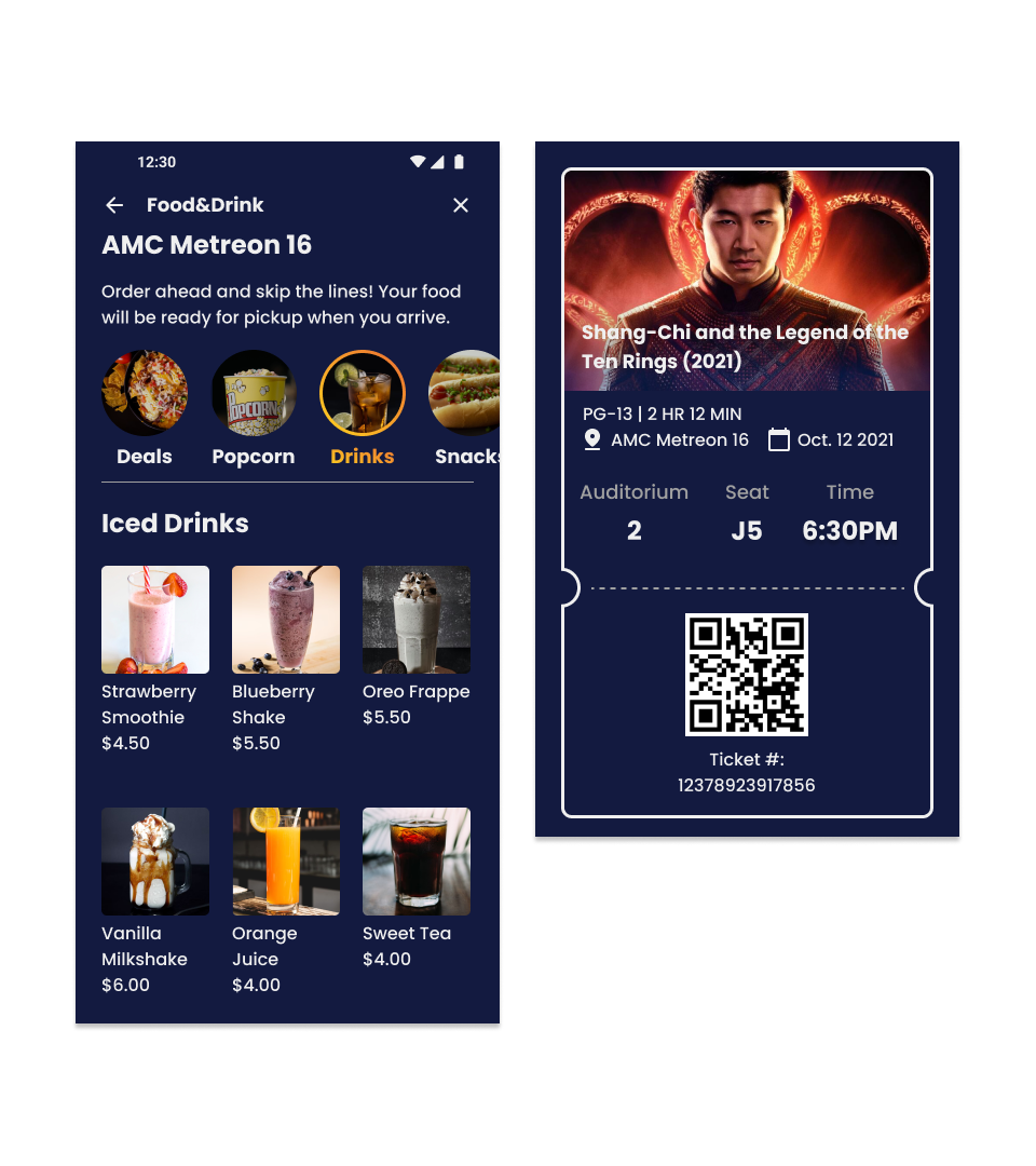
Pain point: Waiting in long lines
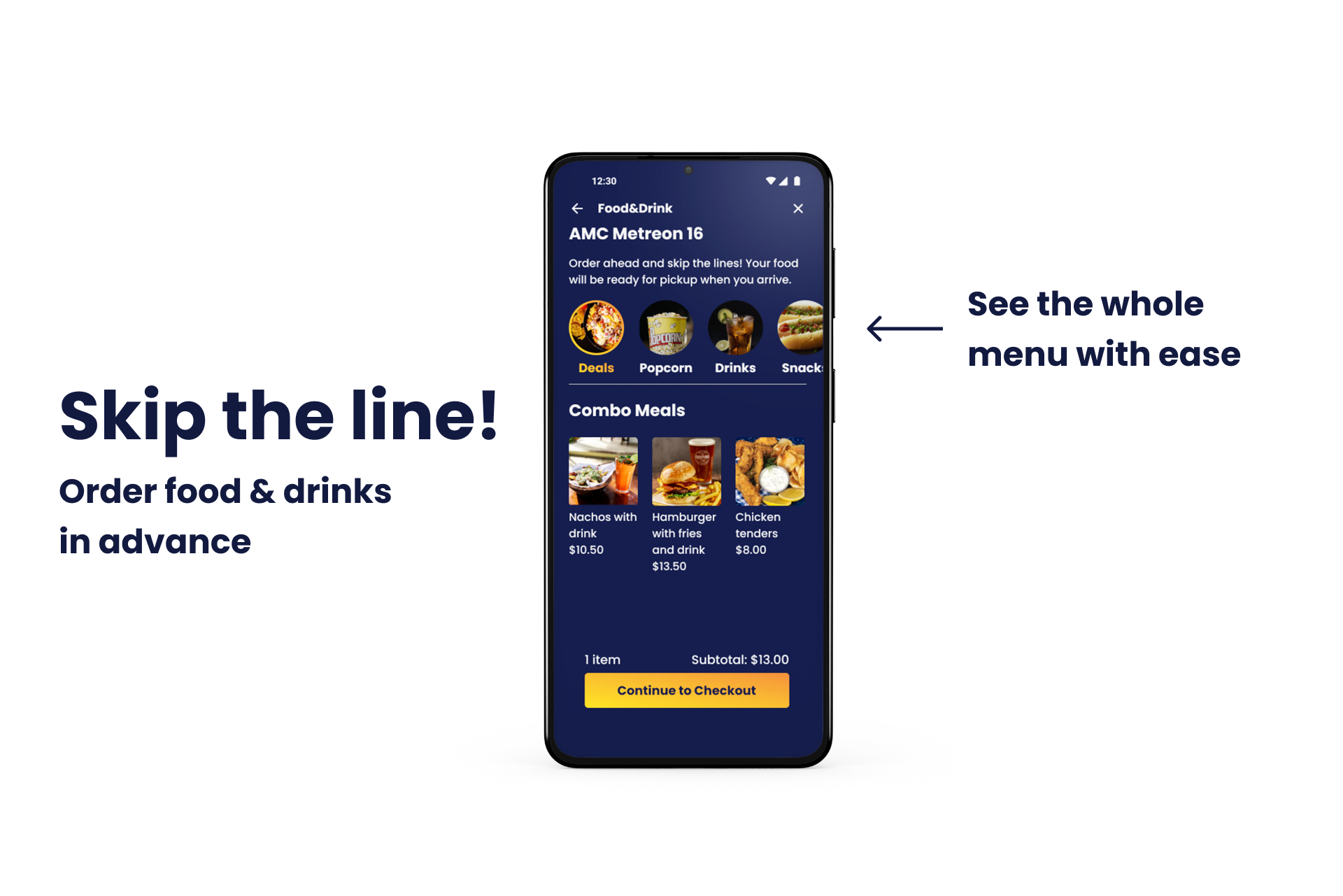
Solution: Users can buy tickets and easily order food in advance via app to save time. Tickets have a qr code for quick contactless entry.

Pain point: Price
Solution: Having a rewards system incentivizes the purchase and hopefully encourages more people to go to the movies.

Improvement Opportunity: Apps lack a share button despite movies being a social event
Solution: Adding a share button to the movie page and ticket page so that users can easily share with others

Improvement Opportunity: Allow food ordering in advance with tracking to save time
Solution: Ordering food without the need to go back and forth pages to see the whole menu. Displaying the status of the order and having notifications for pickup to save time.
What Next?
I would like to conduct another round of usability studies to test the high fidelity prototype. Since I made changes from the first tests, having user feedback lets me know if the experience has been improved or not and what else I can change.
I would also like to create a lighter version of the app for those that think the current app is too dark. Having two different modes is beneficial because it can attract as many users as possible.
What I Learned
Accessibility Considerations
Through the Google UX Design courses, I learned the concept of accessibility and how important it is to consider it in every design. By designing for people with disabilities, I can offer a better experience for everyone else.
This was my first time considering accessibility in a project. I chose colors carefully and made sure they had a contrasting ratio of 4.5:1 to meet WCAG standards. I added text in the navigation bar so that it can be read by a screen reader. I also added voice search for those that prefer to search with voice over text.
Designing with accessibility in mind is something that I haven’t done in past projects, but I plan to incorporate that mindset in every future project that I do.
Thanks for reading!
Take a look at my other projects:

Next Dessert
A dessert cafe looking to establish their online presence and expand their business with a modern responsive website

McChrystal Group Website Redesign
A global advisory services and leadership development firm looking to redesign their website